If you’re building a new website or creating a new brand, you may be wondering how to choose the perfect color scheme to represent your brand.
In my experience, the best way to figure this out is to do a little self discovery and then build everything from there up.
First you have to ask yourself a few questions…
- What does my ideal client feel when using my product or service?
- Which colors represent those feelings?
For some of you, these answers may come naturally, but I promise, for most of us, they take some time. But once you have answers to those questions, picking out your perfect color scheme for your new website becomes much easier. As does picking up the perfect fonts, shapes, textures and more.
But those are all blog posts for another day. Today, we’re going to focus on finding that perfect color scheme!
Basic Color Psychology (also known as how colors make people feel)
Here’s a simple breakdown of each color and how they make people feel. Note that I’ve listed some negative associations in italics. These shouldn’t keep you from choosing a color, but are definitely something to be aware.
Red: Excitement, passion, love, desire, courage, energy, action, enhances the appetite, danger
Orange: Creativity, adventure, competition, force, vitality, strength, enthusiasm, success, balance, friendliness, frivolity
Yellow: Happiness, positivity, optimism, intellect, sunshine, carefree, energy, warning
Brown: Comfort, security, earthy, coziness, warmth, friendship, dirtiness
Green: Nature, optimism, luck, peacefulness, money, health, fertility, growth, generosity, envy
Blue: Stability, peace, trust-worthiness, integrity, loyalty, calmness, cold
Purple: Power, ambition, luxury, creativity, magic, inspiration, wisdom, spirituality, frustration
Pink: Love, femininity, romance, intimacy, playfulness, impulsiveness
White: Innocence, cleanliness, humility, tranquility, Simplicity, isolation
Grey: Neutrality, balance, practicality, timelessness, depression
Black: Power, elegance, sophistication, mystery, boldness, authority, heaviness
Other things to keep in mind when picking out colors
- If you really love a color, you should totally consider including it in your color scheme. If you really dislike one, there’s no need to force it. There are plenty of colors in the rainbow.
- If your brand name has a color, or object in it that is represented by a specific color, you should consider including that color as well.
For example, I LOVE the color yellow. And also fireflies, which glow yellow/green but are often represented by the color yellow. Because of that, there was really no question that I wanted to use the color yellow in my color scheme. Beyond that, yellow also represents happiness, optimism and being carefree, all things I want my clients to feel when working with me.
How many colors should I use in my color scheme?
This is totally up to you, however I recommend a minimum of three colors and no more than six. Regardless of how many you choose, you will then want to choose at least one main color and 1-2 primary accent colors. Too many colors just results in overstimulation and brand confusion. No one wants that. I personally like to choose four and designate them like this:
- One bold color for headers, buttons and call to actions
- One dark primary accent color for texts and symbols
- One light primary accent color for backgrounds
- One additional accent color for use when needed
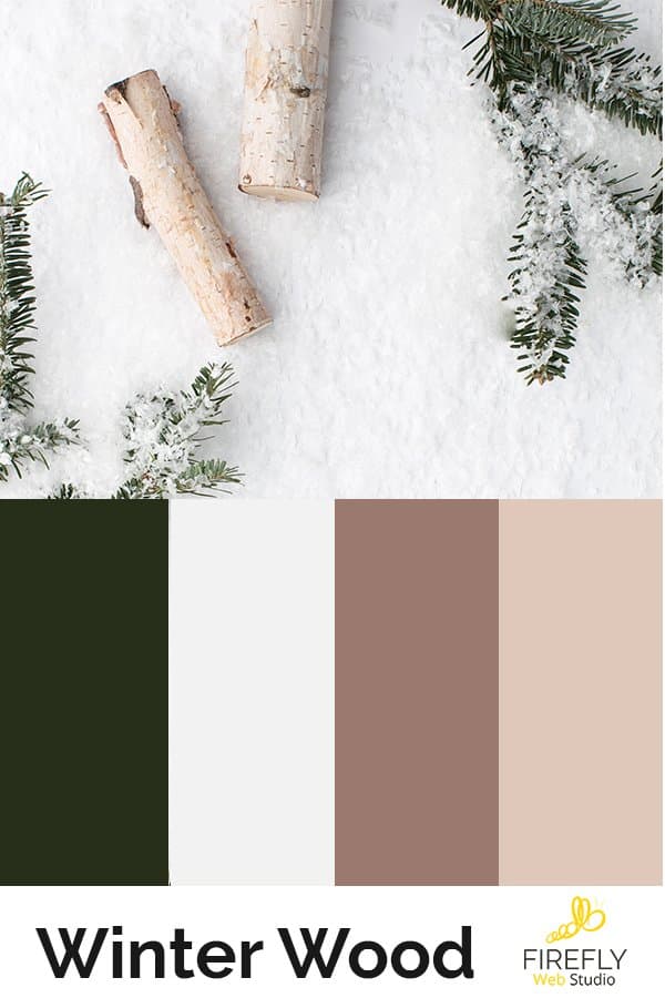
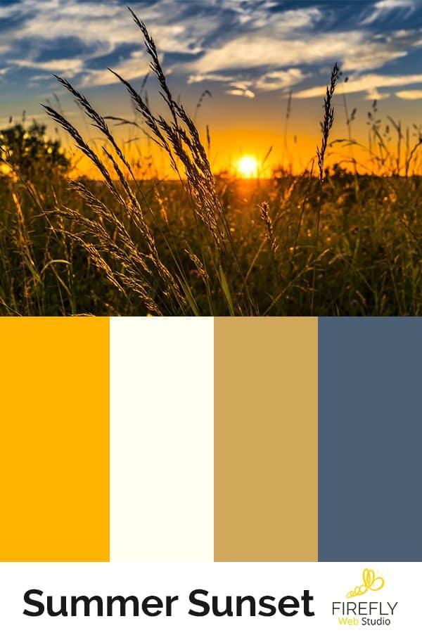
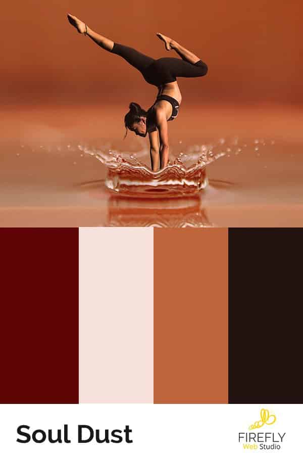
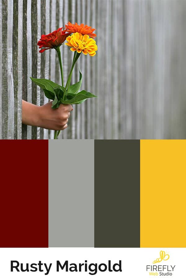
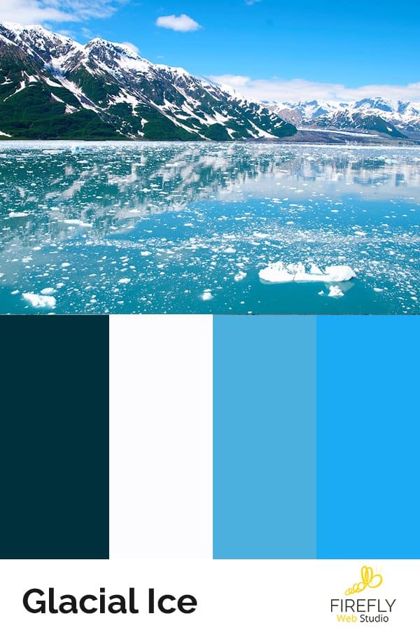
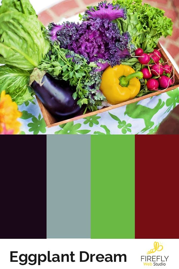
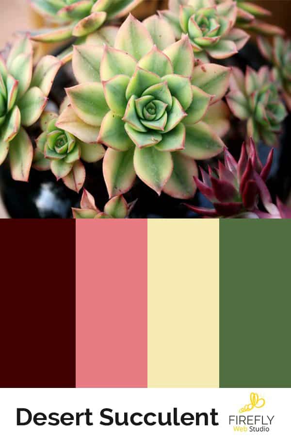
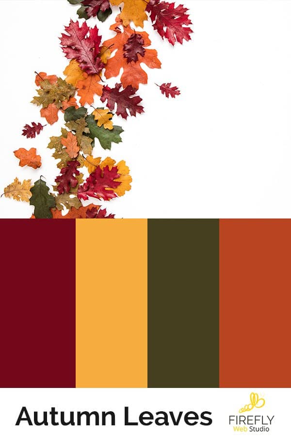
Examples of popular color themes for websites: